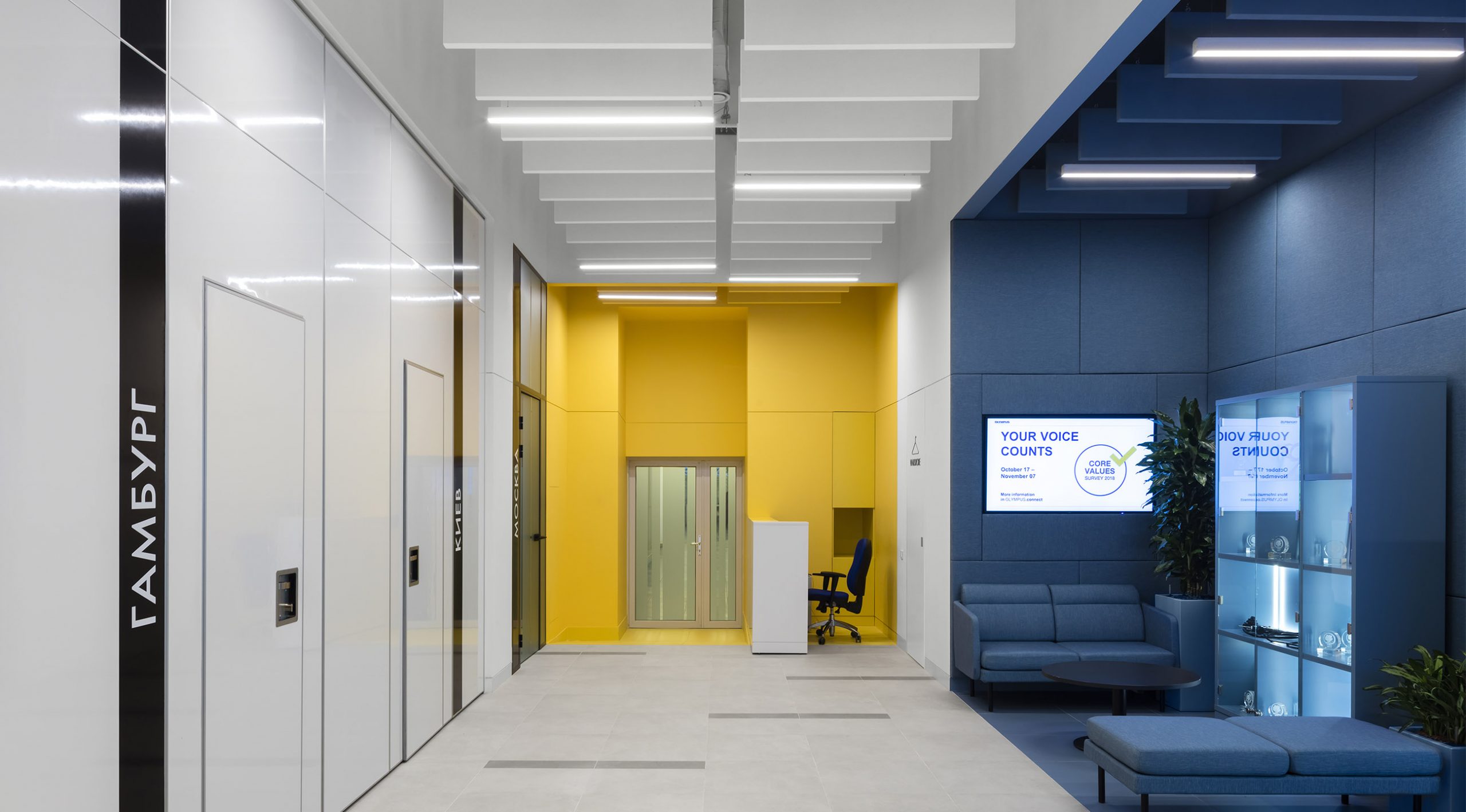
The overall concept of the office space is based on the interaction of bright colored zones surrounded by clean technological space. We visually lowered a very high ceiling with open engineering communications so that the proportions of the resulting rooms looked harmonious. The panels used for this not only serve to create an aesthetic appearance, but also improve the acoustic atmosphere of the office. The floor is covered with porcelain stoneware in different colors.
The corridor connecting the hall with the office spaces is highlighted with accent colors. On the wall is a composition of built-in light lines that echoes with pendant lights.
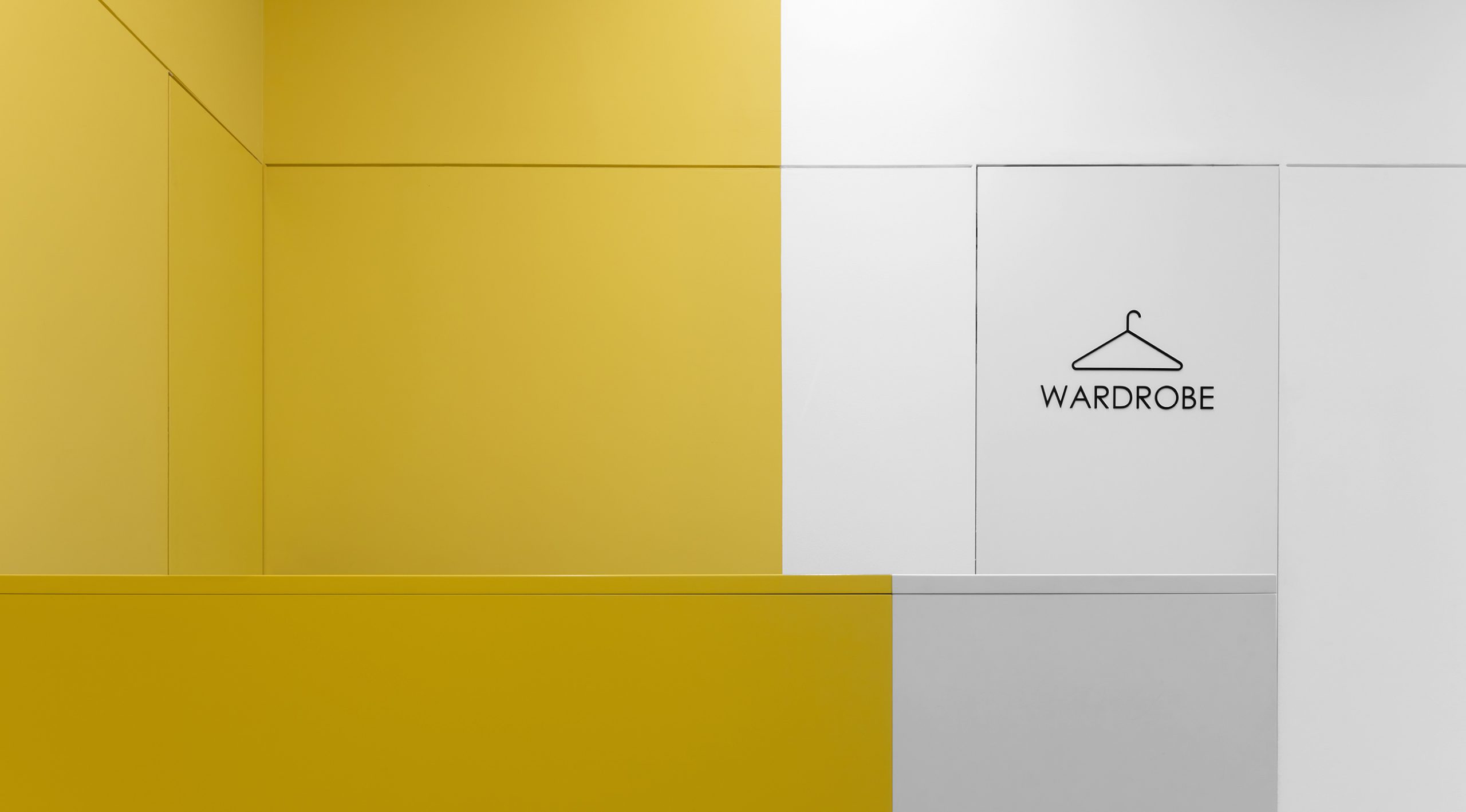
Opposite the office entrance, we placed a brand wall with the company logo – this is the first thing that a visitor sees. The space of the entrance group is a hall with access to a cloakroom, meeting rooms and a waiting area for visitors adjacent to the hall. Here are the sofa groups and display stands, where samples of products and awards from Olympus are exhibited.

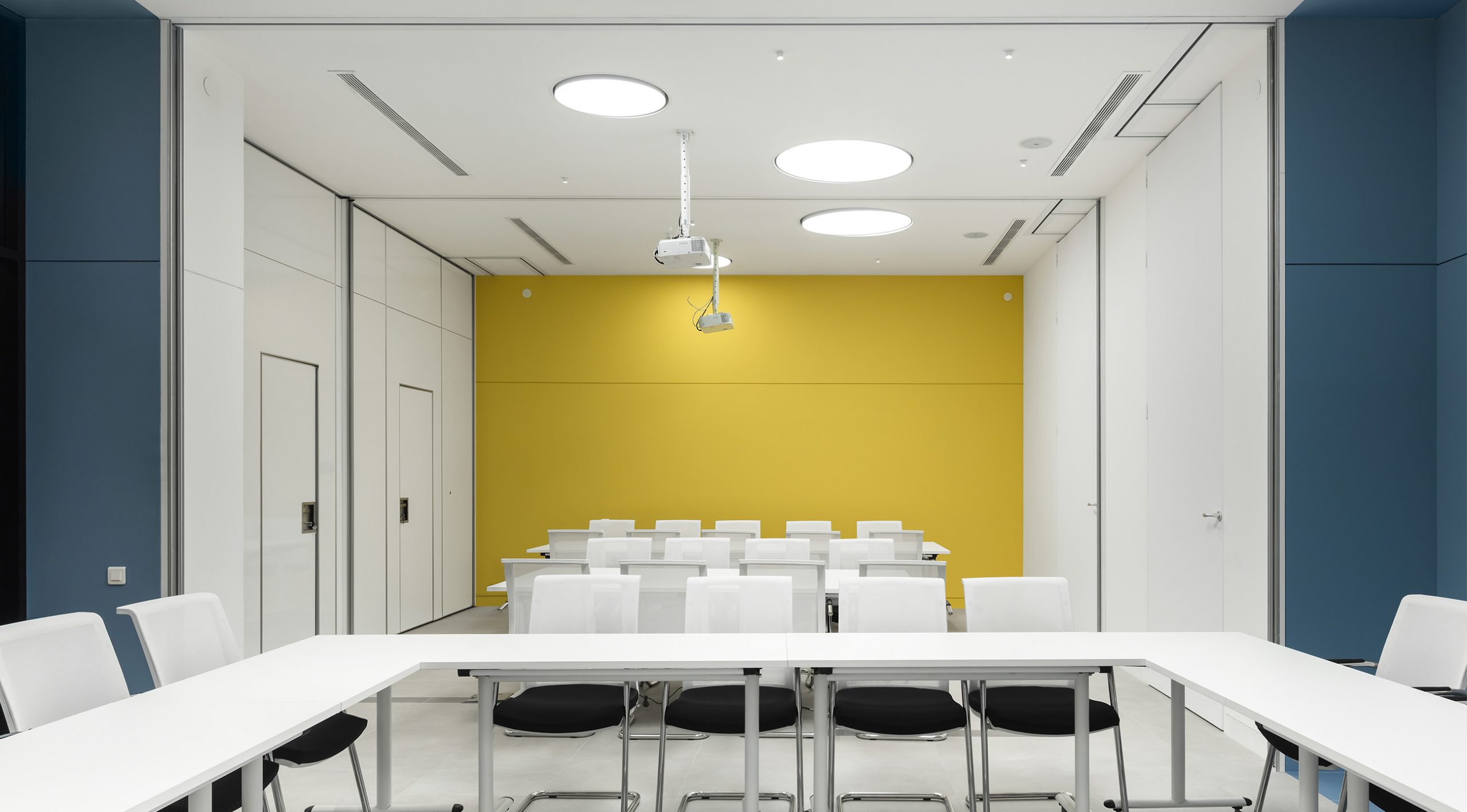
The conference area represents several separate rooms that can be combined into a single space using mobile partitions – they are removed in hidden parking lots – storage. The surface of the partitions allows them to be used as a whiteboard, and any wall of the meeting room becomes an additional communication tool during meetings and events.

The accent is the large round lamps, which, when combined, form a single composition. For even larger events (for example, all-staff meeting), meeting rooms can be combined with a common hall.
The office workspace is extremely laconic, which should help employees fully concentrate on current tasks. The general principle is the color zoning of the room – a combination of white and yellow zones.

