While working on the design of the sales office of the Twelve residential complex, we were inspired by the contrast that strict, static, “eternal” urban forms create with their surroundings – the continuously changing nature, fluid and impermanent.

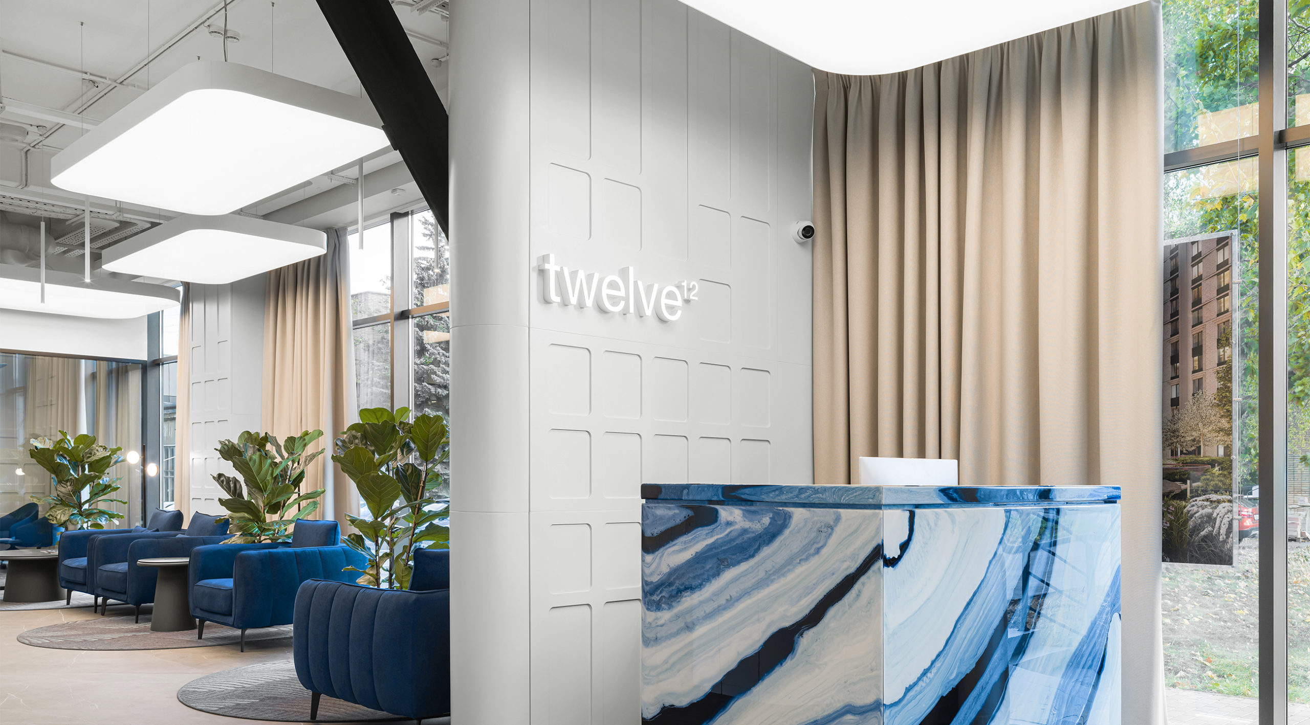
The main elements of the waiting area space were the reception desk and the layout counter. They are made in the form of simple volumes with clear lines and smooth edges. Their appearance is given dynamism and freshness by a complex, deep pattern reminiscent of a flow of air or water, captivating at a distance and surprising with its depth and complexity at close range.
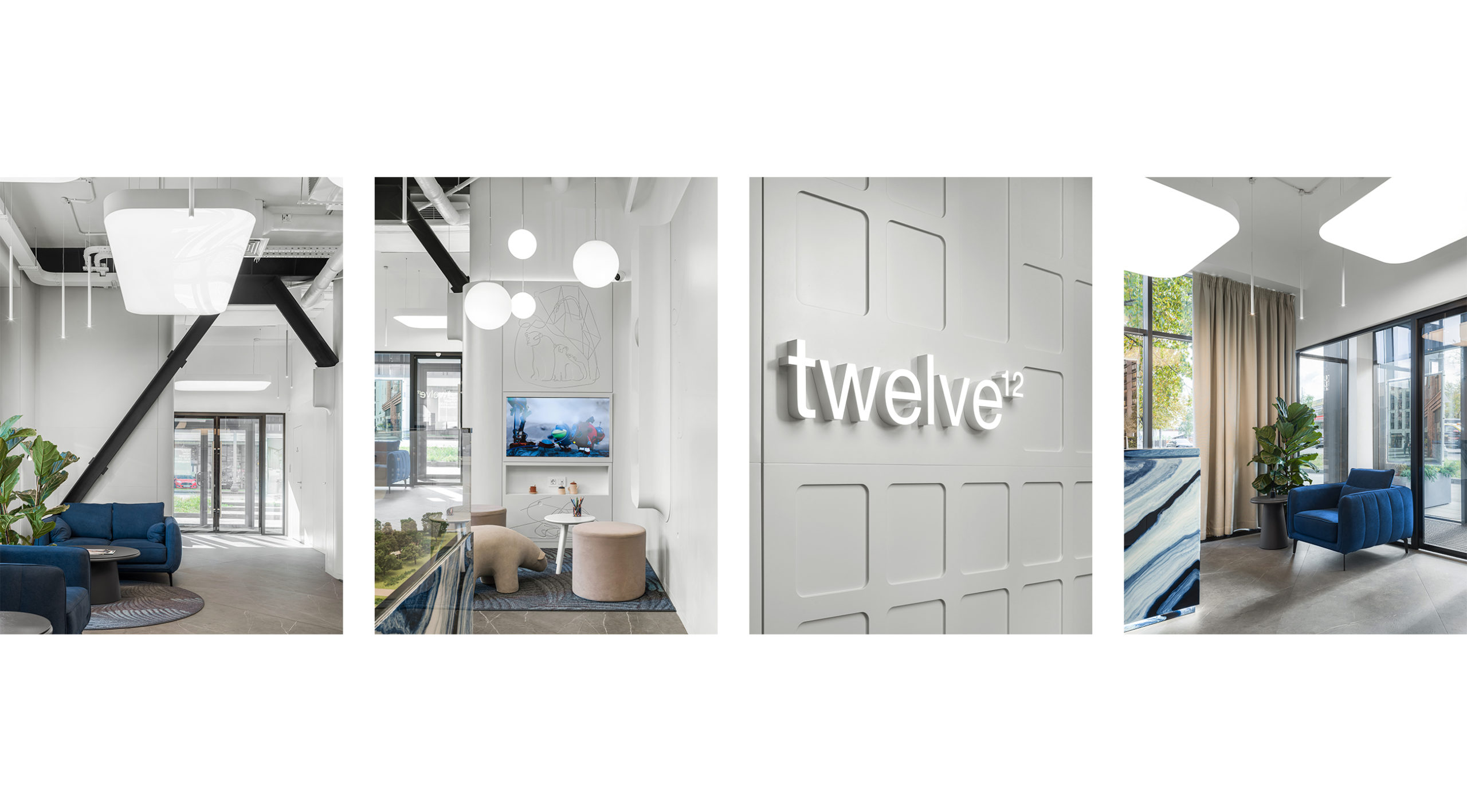
Therefore, in some places we use smooth, sand-colored panels with recessed elements, the rhythm of which is reminiscent of the windows of a large house, and in other places we lay out a carpet made in cold colors and floral patterns, cutting it along the “wrong” line. In some places we expose the prosaic utility lines and load-bearing frame of the building, and in others we use a dynamic complex texture and soft, streamlined forms.
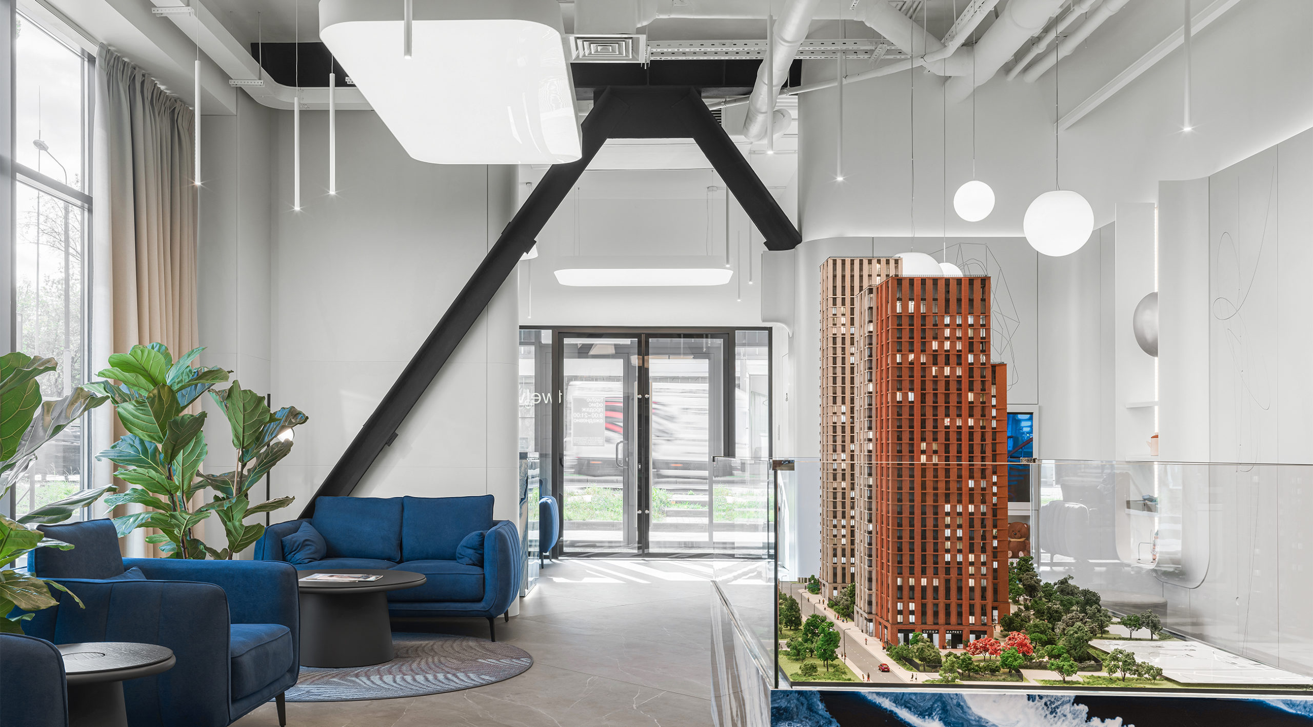
The waiting area with the layout in the spotlight is revealed for the upcoming “Twelve”. In addition to it, we have provided four meeting rooms, one of which is designed for a large family, a wardrobe, a coffee point, a children’s play area and a back office with everything necessary for comfortable work.
In the mock-up area we placed an interactive mock-up that works in connection with the television panel, and next to the mock-up there was a children’s area, where we also provided a TV with a game console, funny poufs and toys.
The interior of the meeting rooms is dominated by the blue color scheme of the carpet, combined with warm light wall panels with a strict relief. The accent in this ensemble is an unusual chandelier – a disk suspended at an angle, which, with its “irregularity,” ties into the curvilinear shape of the table.

The interior of the sales office for the Twelve residential complex turned out to be both fresh and cozy, strict and soft. We were able to combine complex shapes and textures with simple surfaces and solid color schemes, creating an interesting and comfortable space.


