When developing the concept, we set the goal of creating a clean and bright impression of the interior. For this we used simple shapes, light colors, texture of natural stone and matte copper.
For the front entrance lobby, we used a finish made of glass-fiber-reinforced concrete panels with an imitation of natural roughly processed stone, combining it with irregularly shaped brushed copper planes, which is why sharp corners and triangular planes appear in the interior. The fragmented use of metal is compensated for by a unifying element – a frieze with a barcode pattern, which runs along the perimeter of the entire room as a ribbon.
In our opinion, the solution of the postal zone turned out to be interesting. In order to accommodate as many mailboxes as possible, we created additional walls, which is why the room began to remotely resemble a maze. The drawer fronts are grouped to create large copper planes contrasting with the texture of the walls and embossed frieze. All elements of the room are united by a circular light niche in the ceiling.
Помимо помещений входной группы, предусмотрена детская зона. Здесь мы расположили целых два круга в потолке, один из которых является настоящим зенитным фонарём, а другой дополнен необычными светильниками-шарами, похожими на фантастическое облако.
One of the most important decisions in terms of functionality was the adaptation of the lobby leading to the courtyard of the complex into a coworking space. We have turned this communication space into a work area where residents can work remotely outside the walls of their apartments, hold working video meetings and even organize a meeting in a mini-meeting room. To highlight the coworking space in the overall style of the interior, we used a dark terracotta color for the walls, which, in combination with unusual upholstered office furniture, creates a soft and comfortable impression of the interior. As in the rest of the rooms, we made a large circle of light highlighted by a copper cylinder and a counter with workstations as the central element.
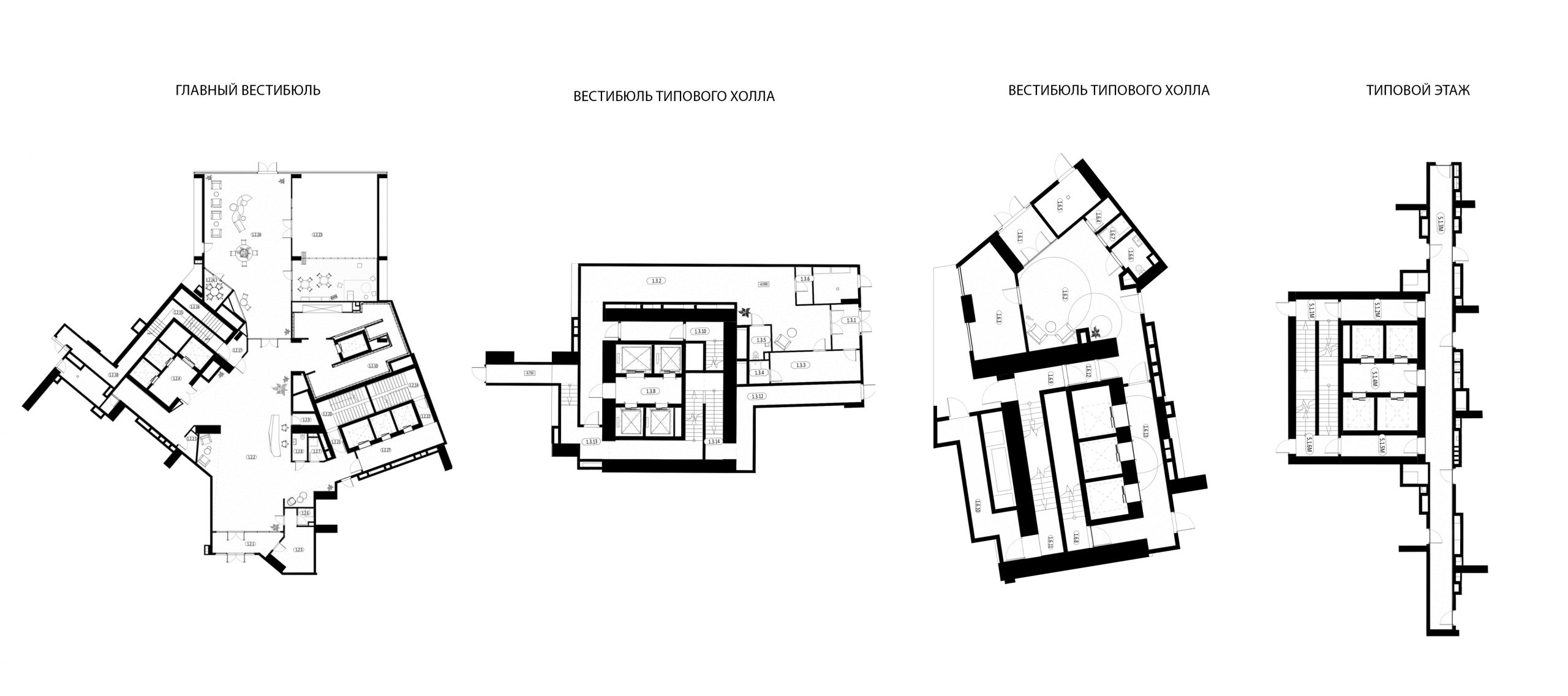
Из парадной входной группы, минуя внутренний двор, жильцы попадают во входные группы одного из трёх корпусов. Несмотря на то что в этих входных группах мы применили решения, аналогичные решениям парадного вестибюля, здесь предусмотрены разные паттерны фризов и рельефных стен. Например, если в первом корпусе применён штрих-код, то во втором – треугольники, а в третьем – круги.
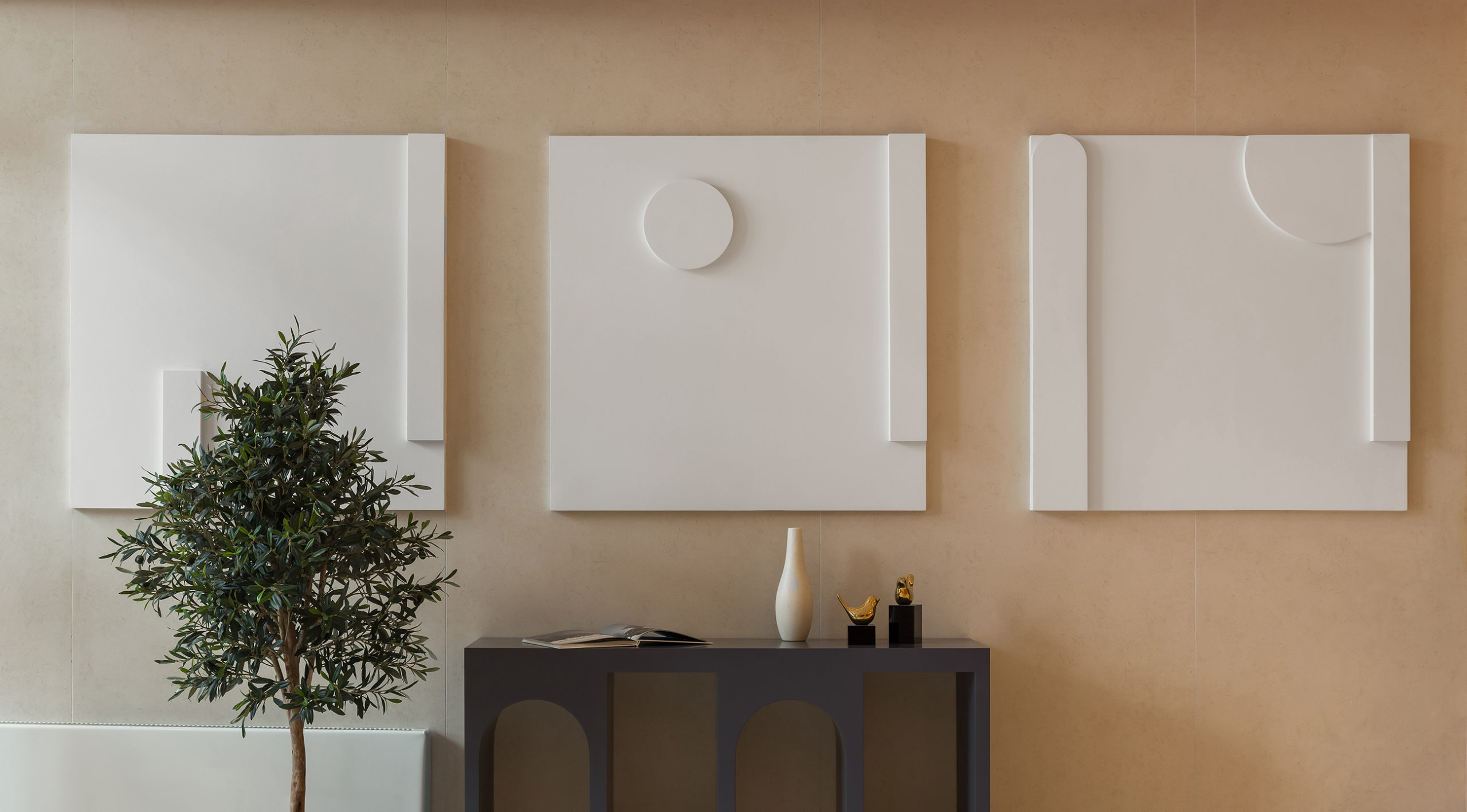
Дизайн типовых этажей мы сделали более простым и минималистичным, но с отсылкой к решениям входных групп. Например, в лифтовом холле мы применили рельефную стену из стеклофибробетона с поэтажной навигацией, а стены украшены рельефными геометричными панно. Также мы применили компланарные двери с отделкой под дерево, с большими дверными порталами, которые мы дополнили аккуратной навигацией из металла.
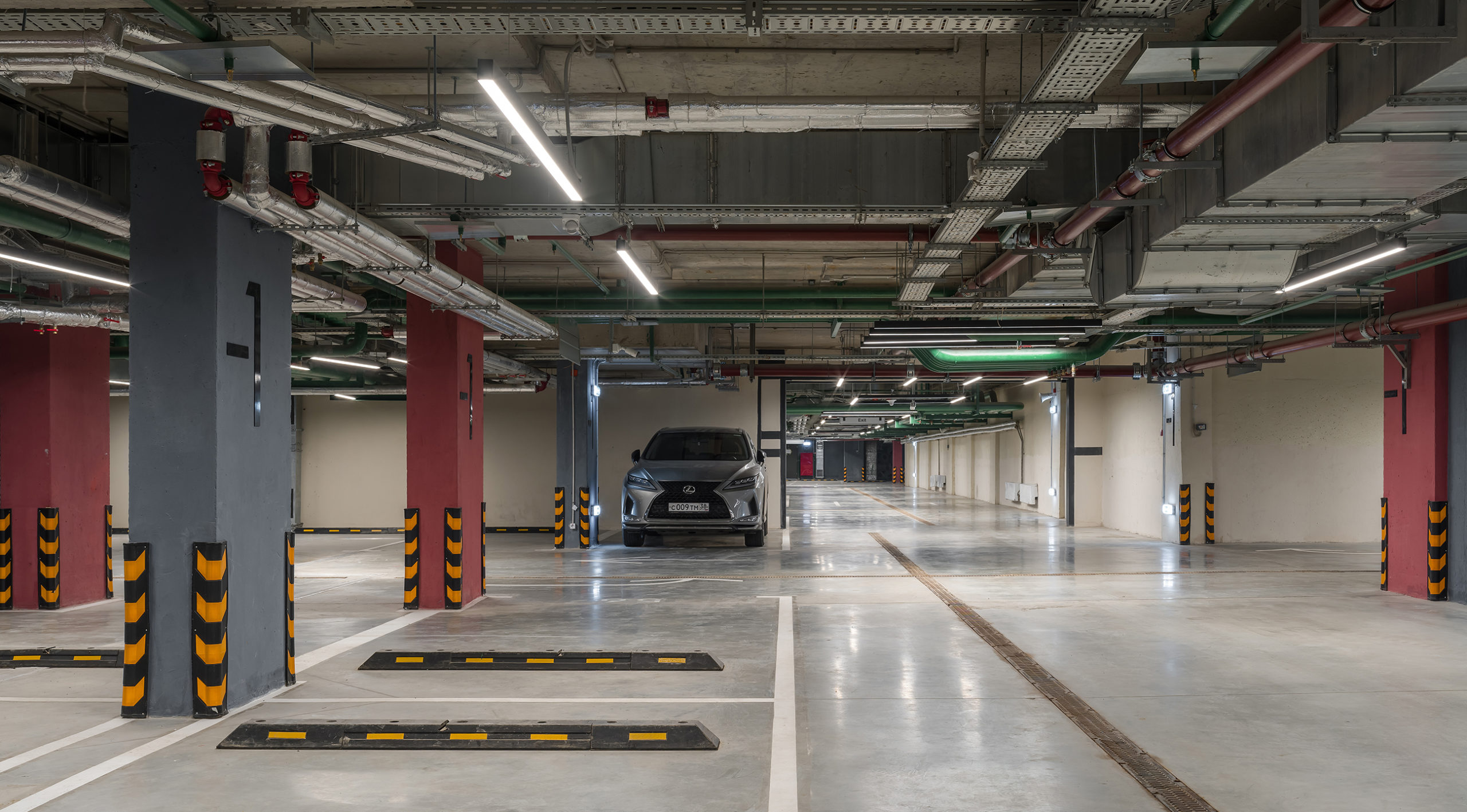
Not a single progressive residential complex is complete today without underground parking. Today it is already obvious that these premises also need high-quality design. We linked the design of this zone with the stylistics of the other zones, but gave it a more technogenic character. The anthracite ceiling combined with the unusually positioned linear lights and dark terracotta columns create a soft feel not usually found in such rooms. We highlighted the staircase and elevator nodes with color and navigation for ease of orientation, and left the floor light, highlighting the markings on it in a dark color.
Можно сказать, что дизайн интерьеров общественных пространств ЖК “Архитектор” формирует впечатление спокойствия, надёжности, долговечности. Это именно тот эффект, которого мы стремились достичь наравне с удобством и функциональностью общих зон. Простота объёмных решений сочетается здесь со сложностью фактур, а чистые геометрические решения – с световыми решениями.

